Name
University Valet
Skills
Brand Identity / Brand Extension
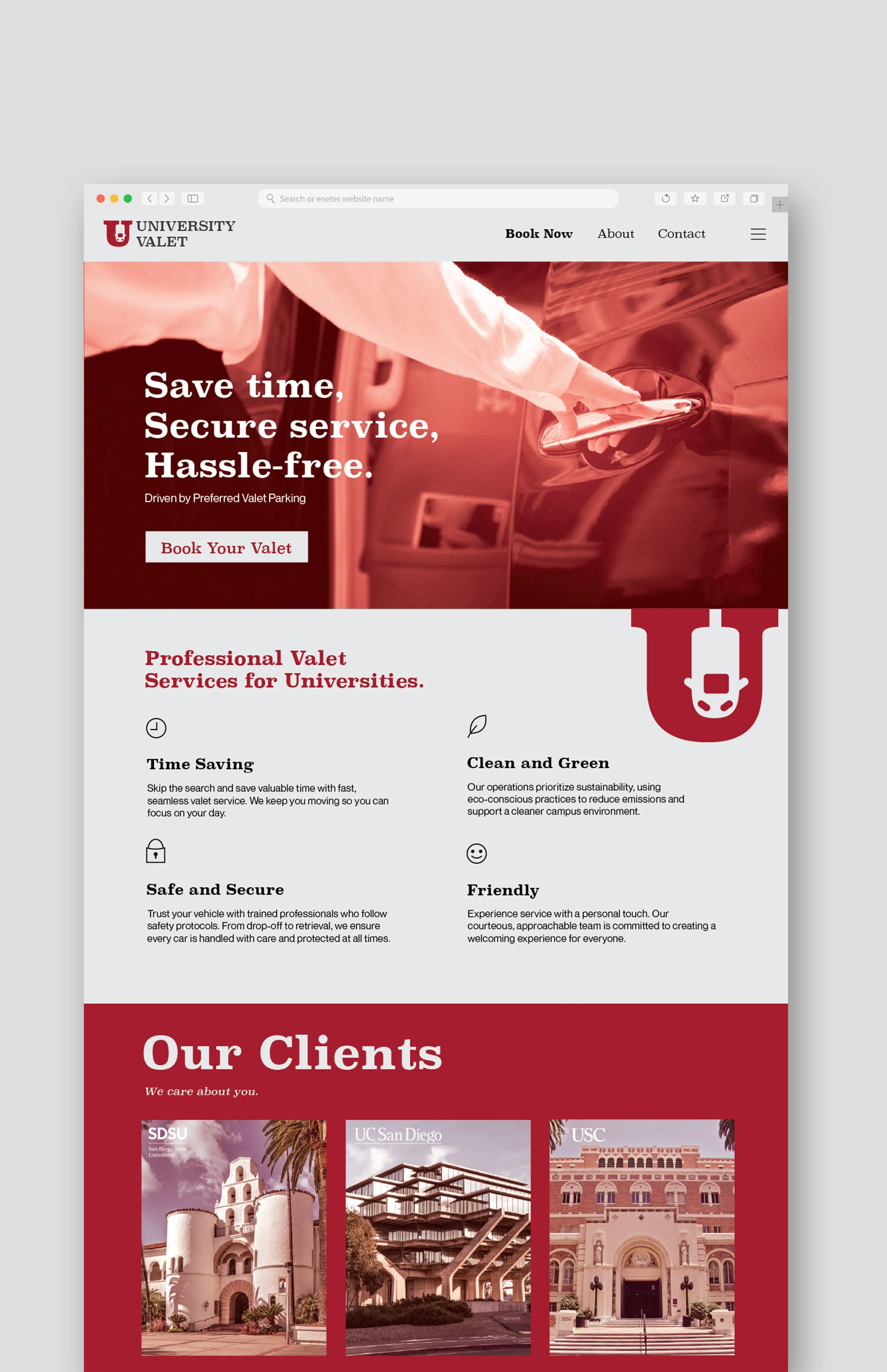
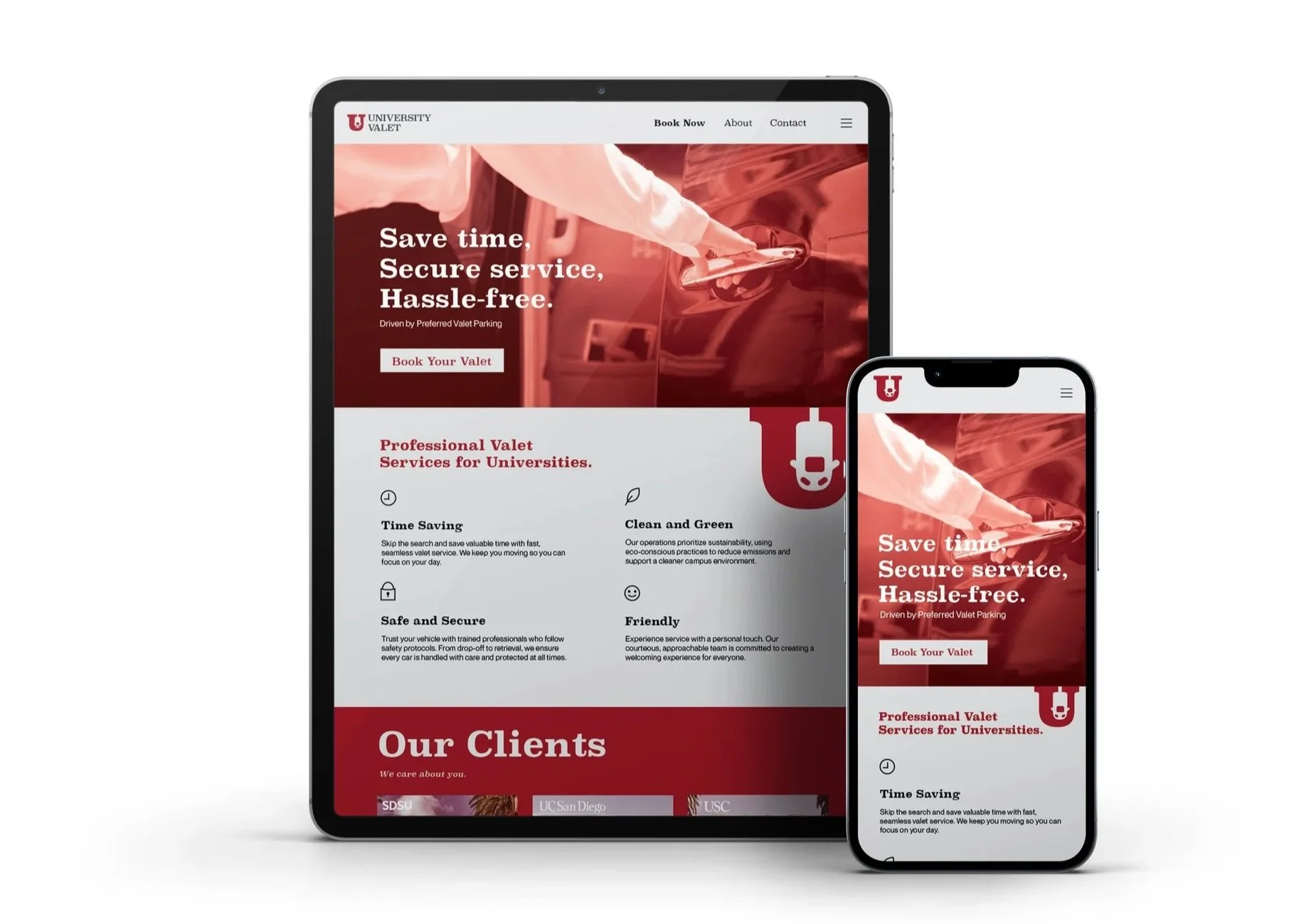
Develop a strong brand identity for University Valet, a specialty service created for the needs of commuter, populations, events, and universities, that highlights convenience and dependability for commuters while reflecting the company’s basic values: honesty, transparency, communication, teamwork, and athleticism.
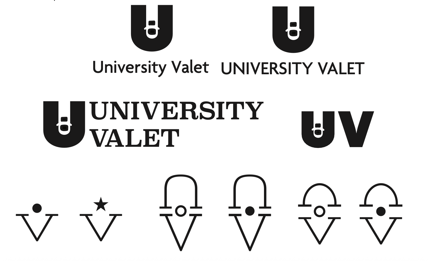
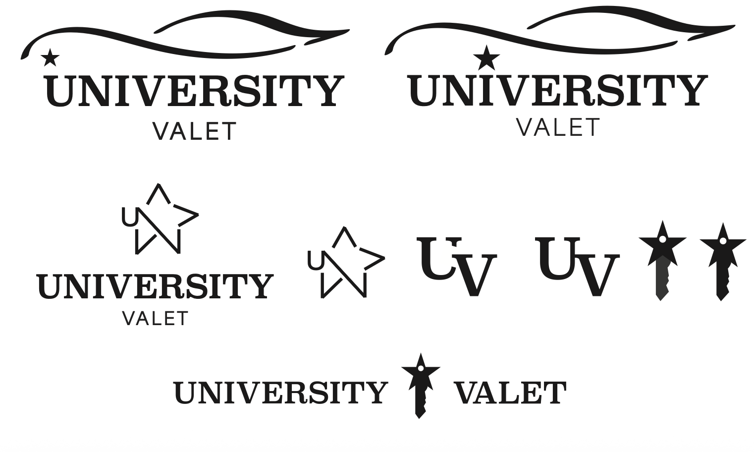
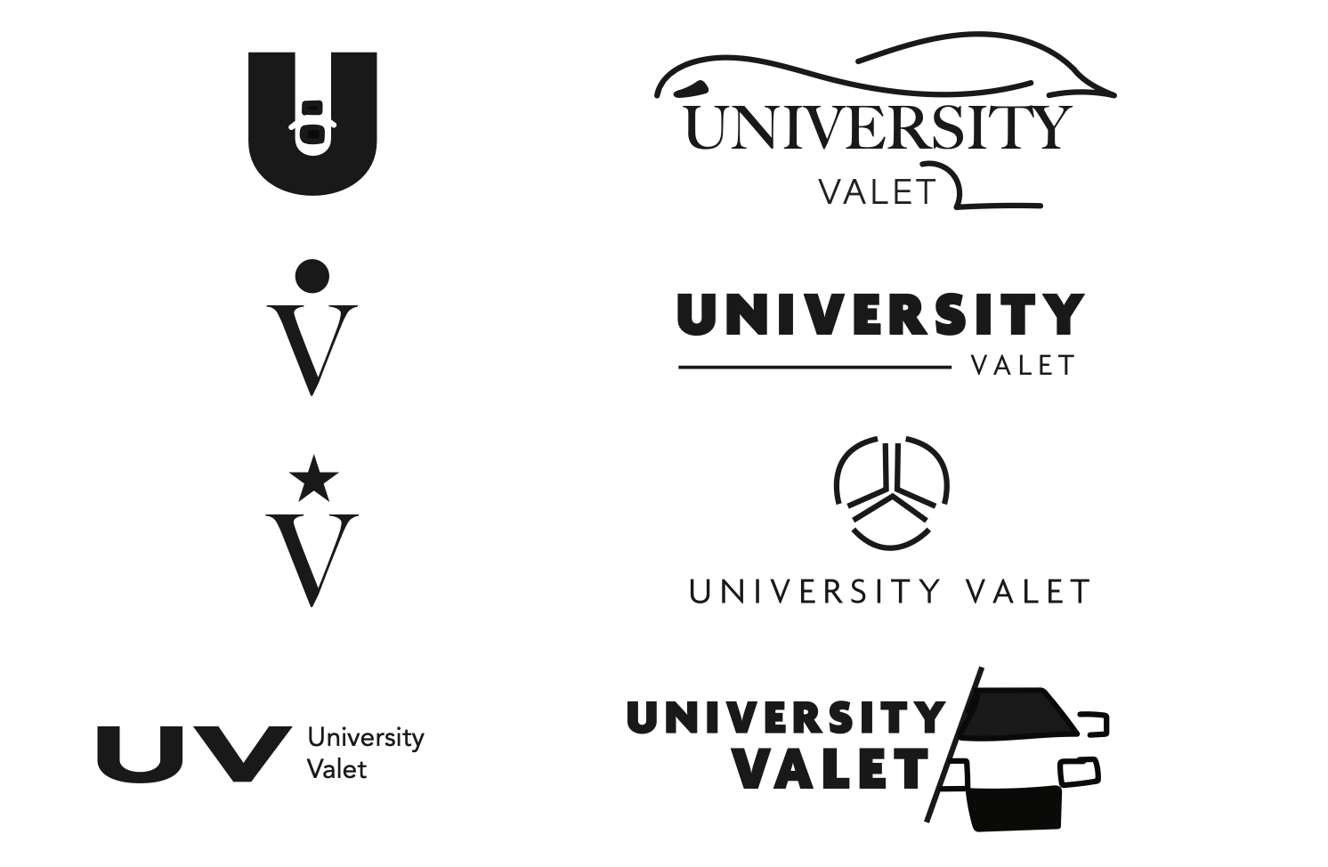
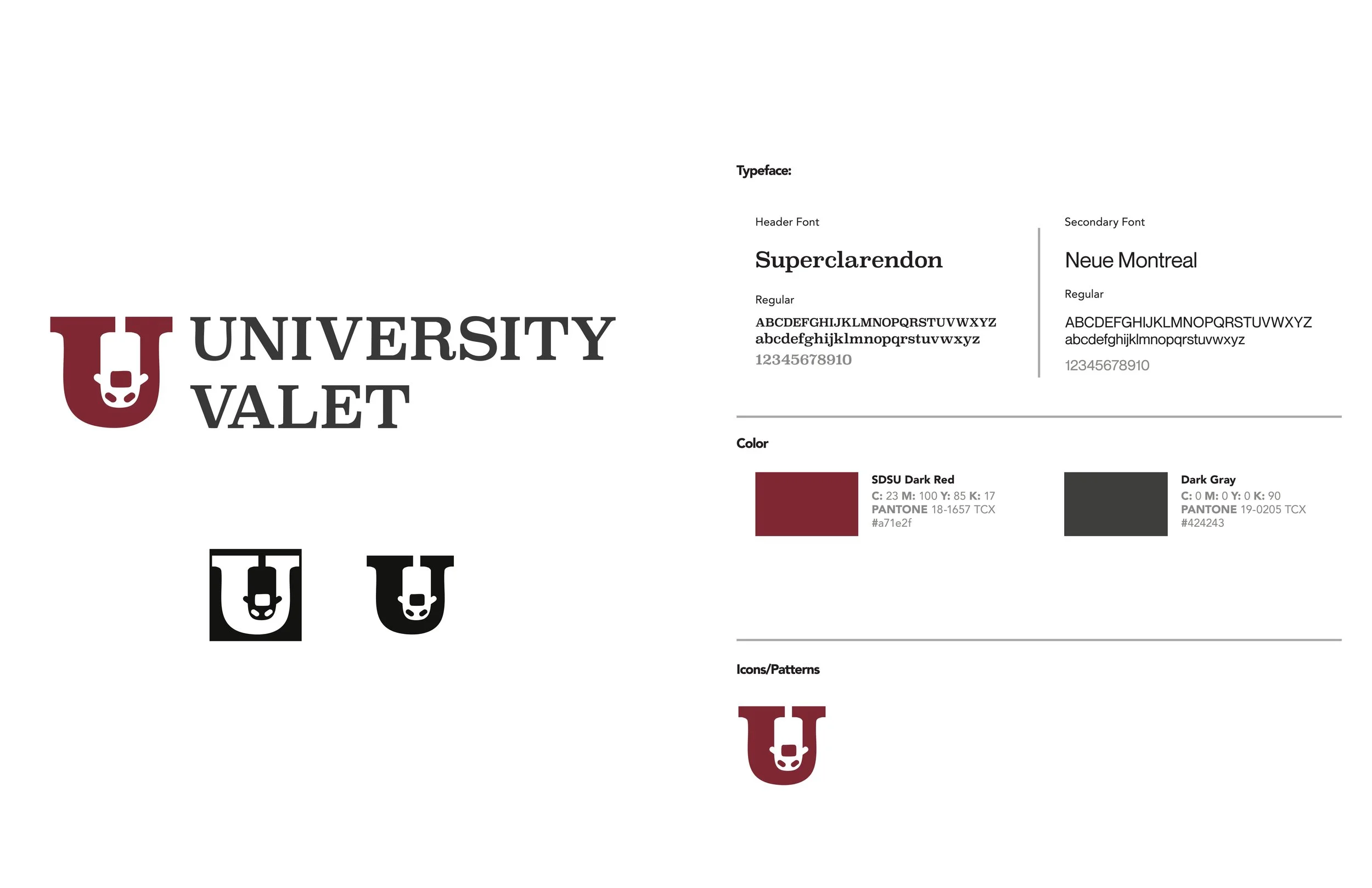
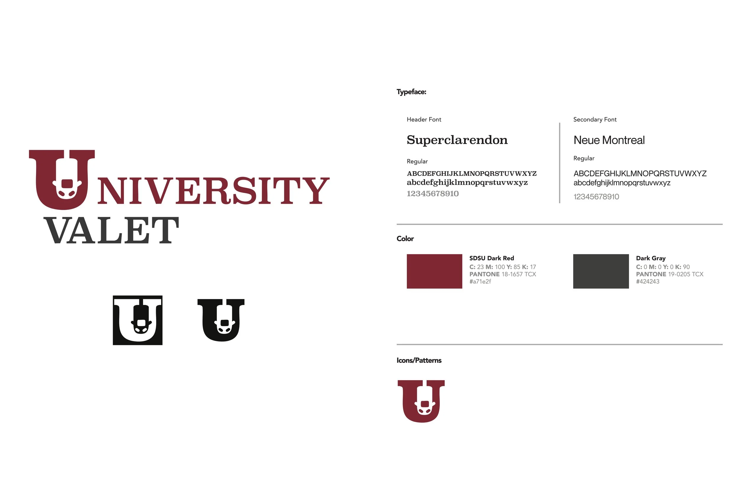
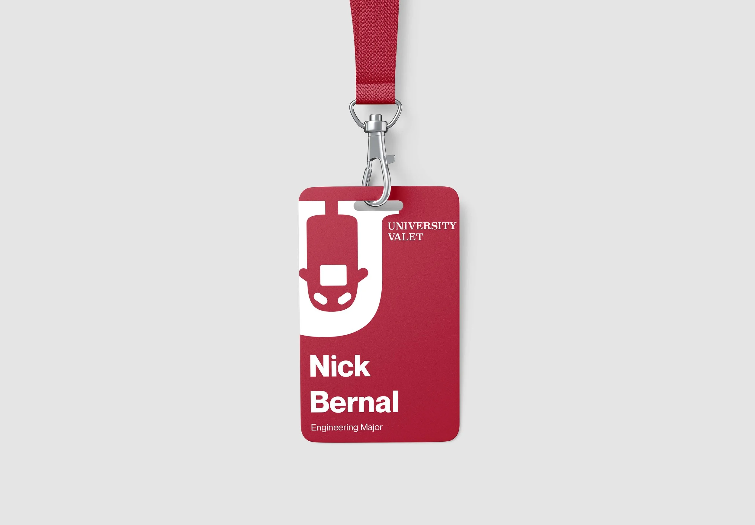
When I designed a logo for University Valet, I wanted to have the logo be recognizable the second you look at it, while still being professional. To achieve this, I incorporated a car icon with a slab-serif typeface to represent a collegiate look. Inside of the slab-serif ‘U’, there is a parked car within it to show that it is easily identifiable, being a valet service. The icon could also stand alone. I chose the logo to be SDSU’s University Red because it represents high status and focuses on the collegiate aspect of the brand.

Final Logo

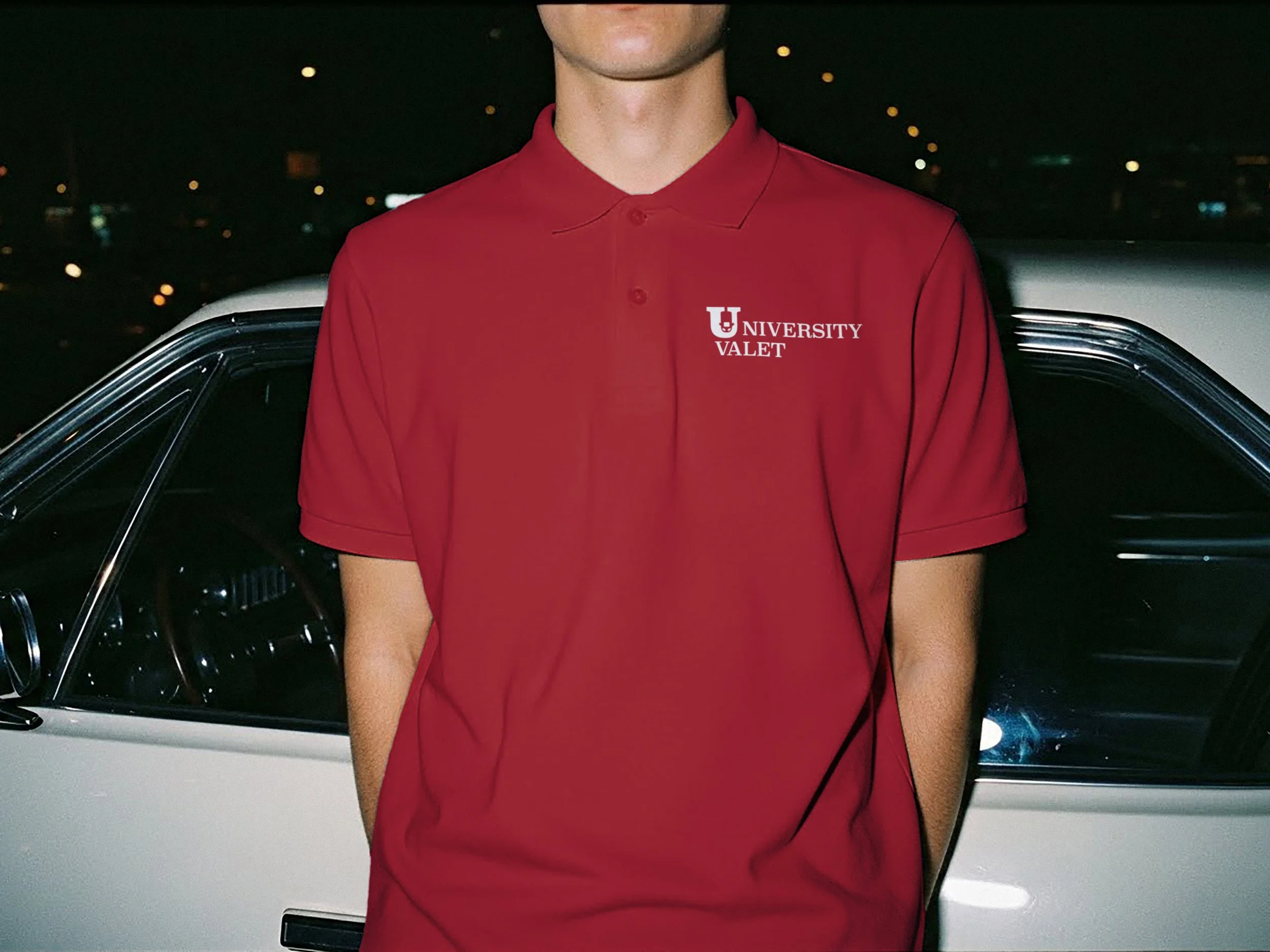
Logo for embroidered material
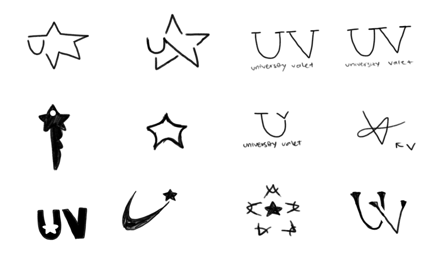
University Valet’s motto is "turning parking pain into parking pleasure”. They are focused more on being an accessible brand that elicits hospitality , which I was inspired by. These design sketches were translated from their service benefits, such as “clean and green”, “safety and security”, and “high quality and professional”.
Initial Design Sketches