Name
Fleuron
Skills
Packaging Design / Brand Identity
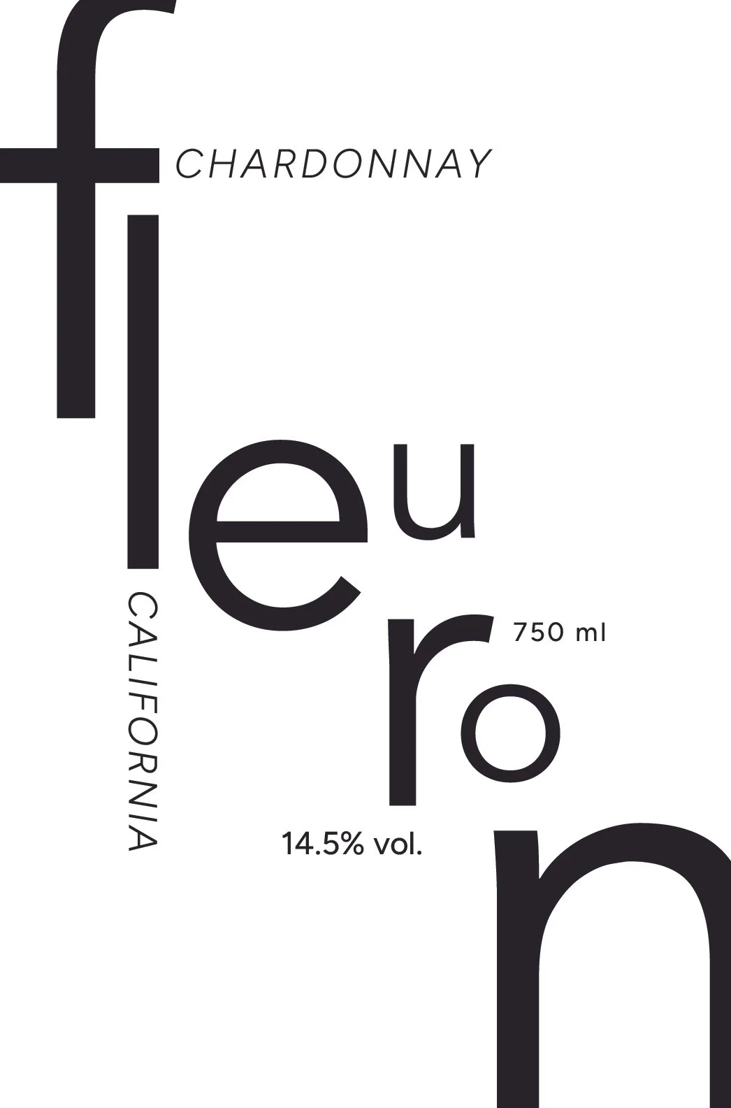
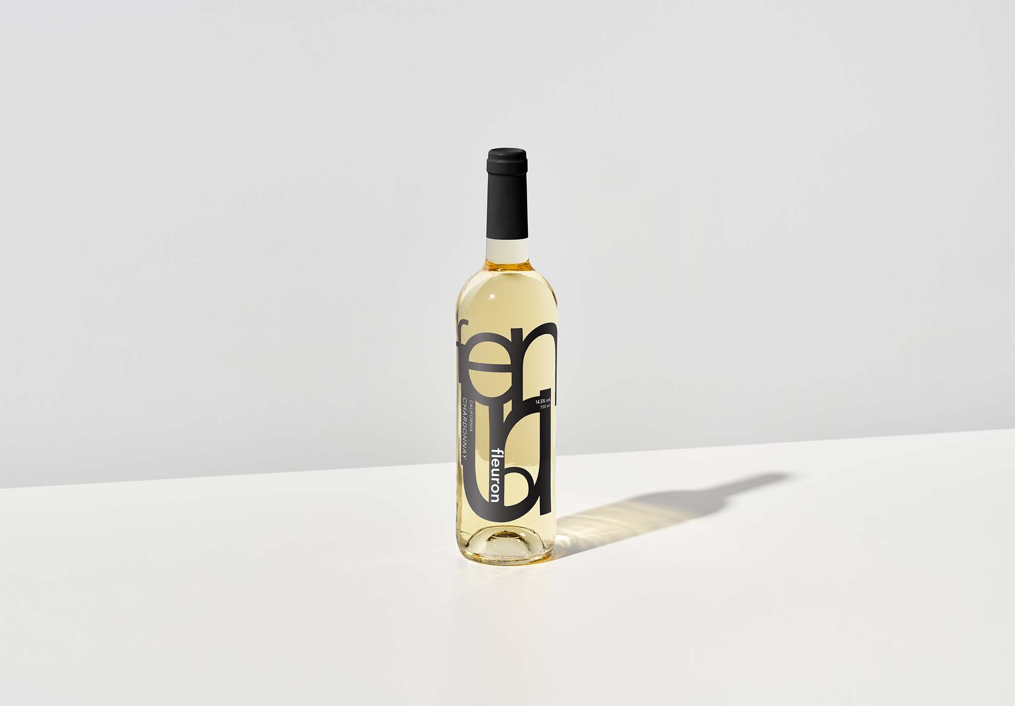
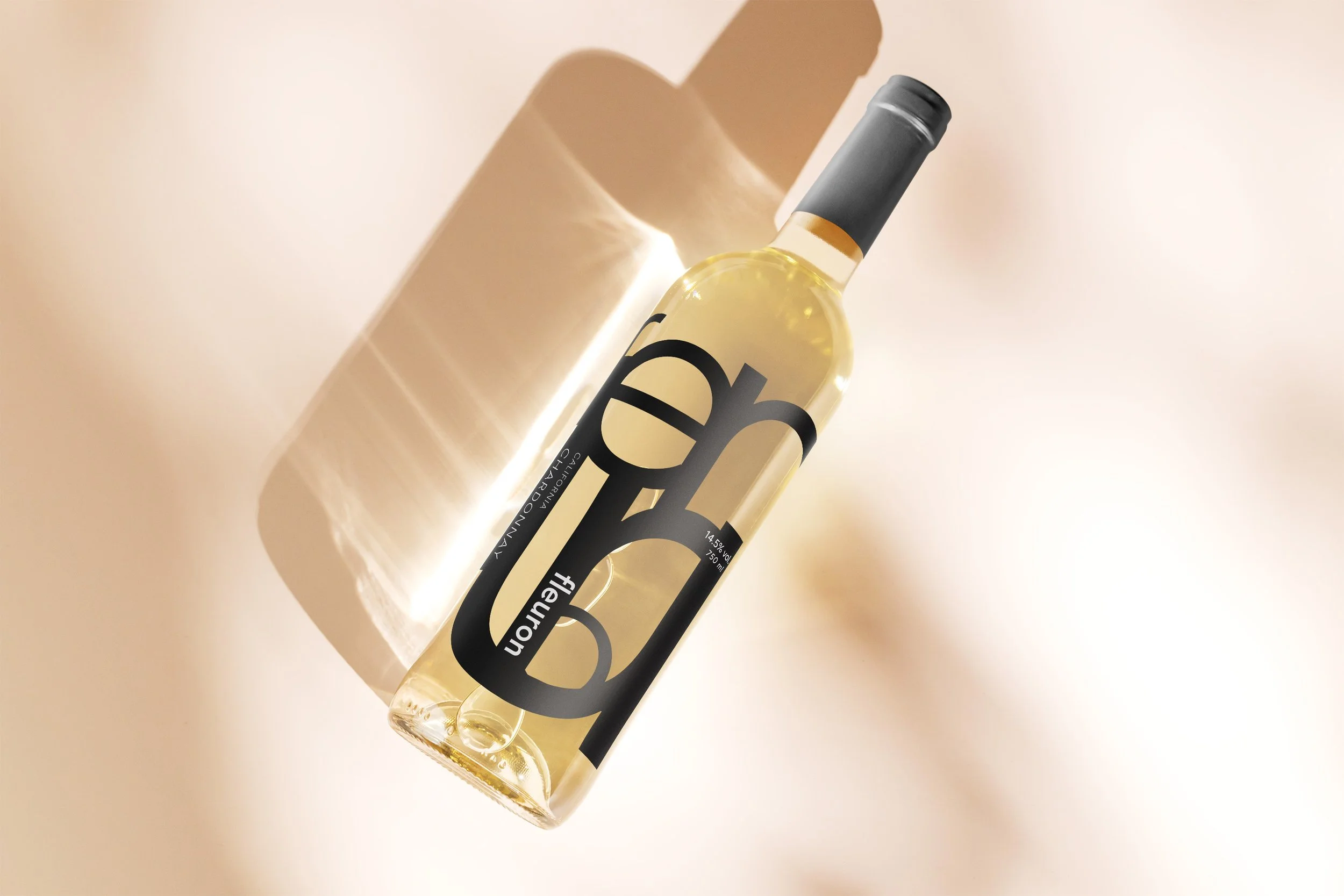
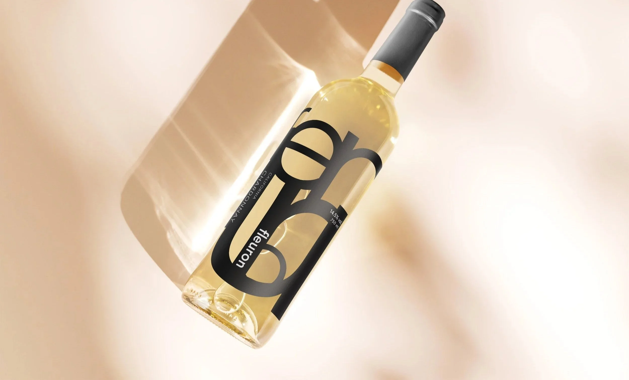
Design an experimental wine label for 21+ adults who prefer subtle, minimalistic, clean designs, focusing on a typographical design.
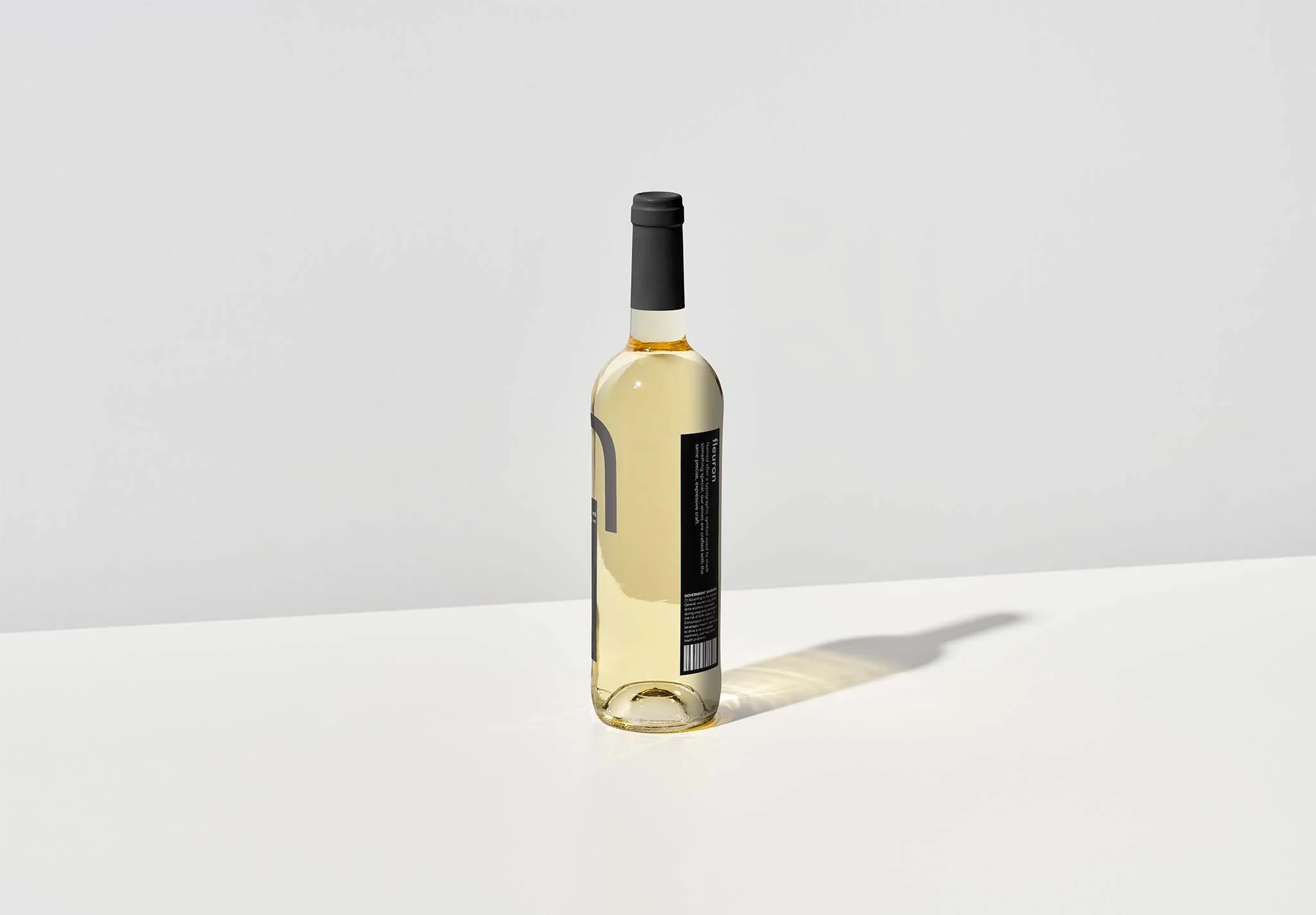
Fleuron, named after a typographic symbol used to mark something special, represents how much time and love we put into our white wine; our wine are crafted with the same precise, expressive craft. Fleuron is a great drink to have during the nighttime and at a candlelight dinner. Our brand is minimalistic and simple that hints the beauty of typographic styles.
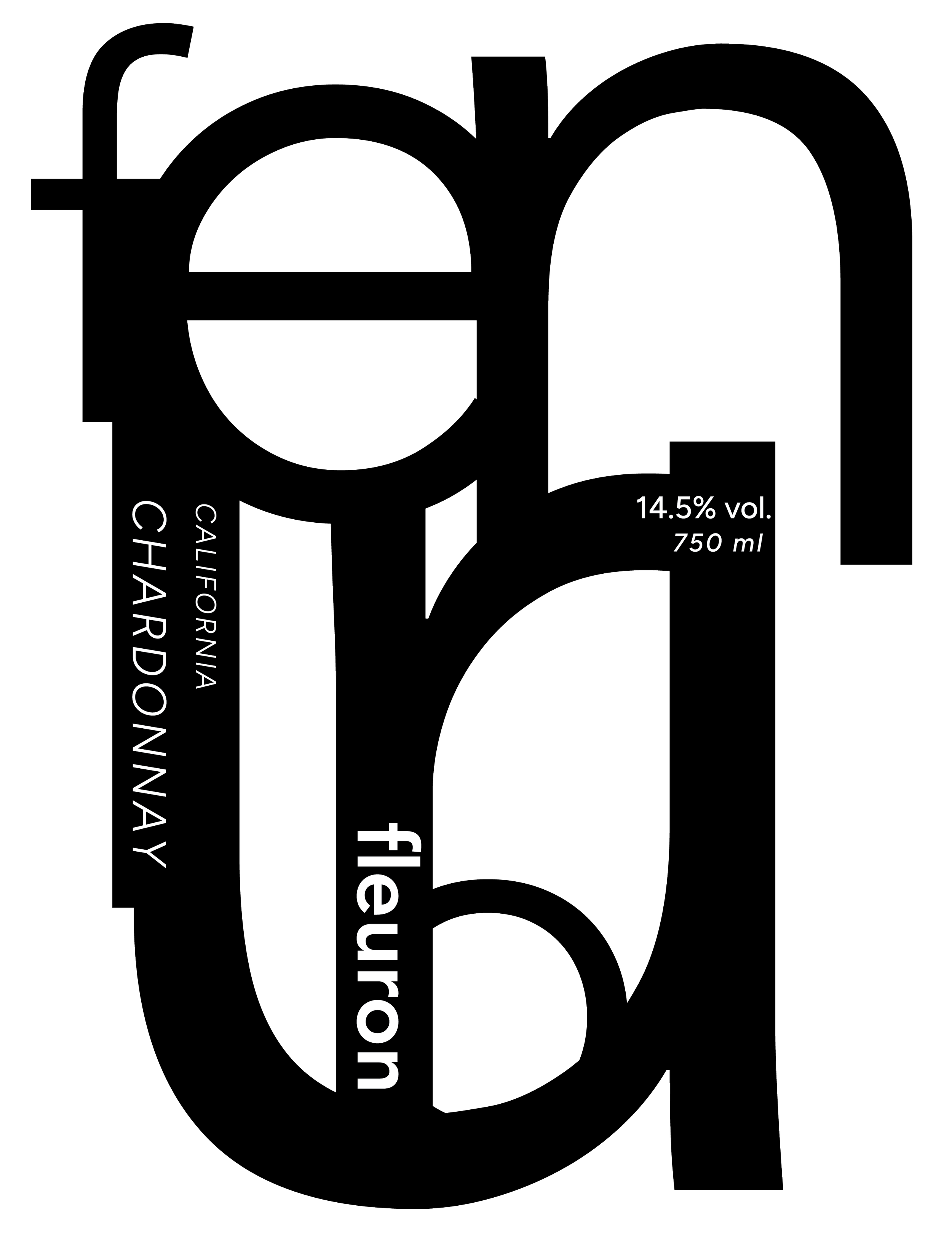
Front Design
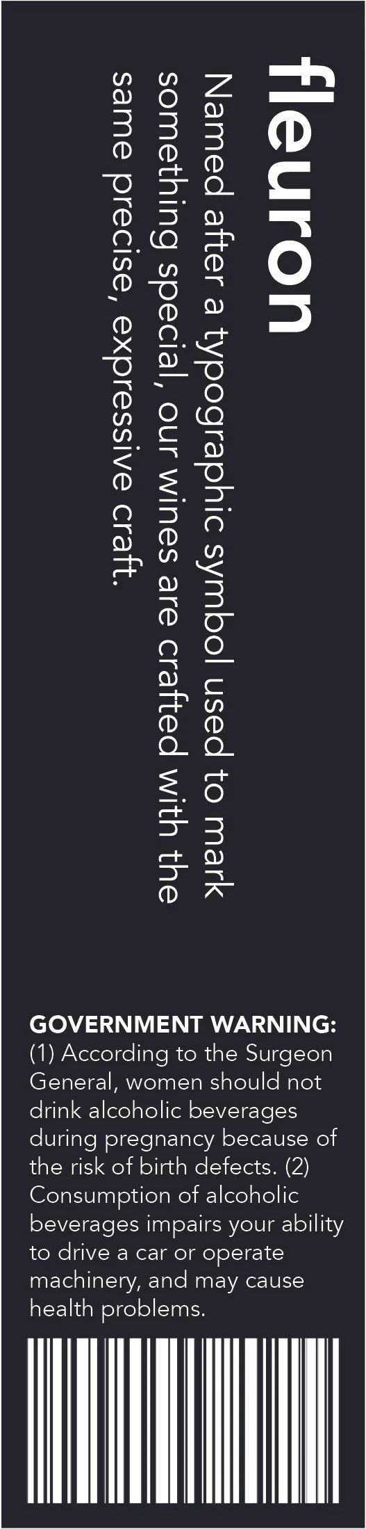
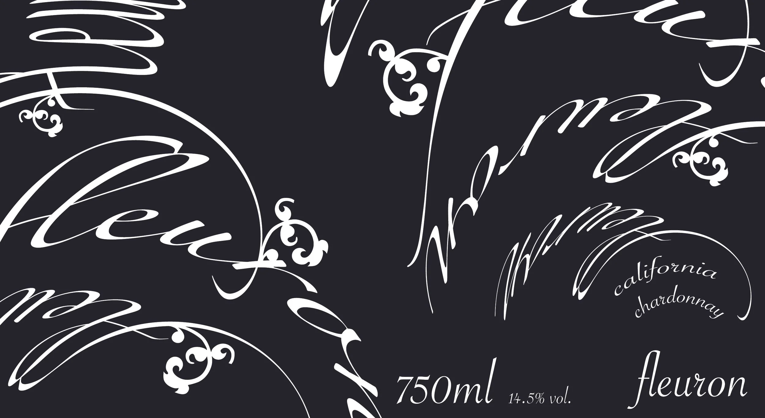
Back Design
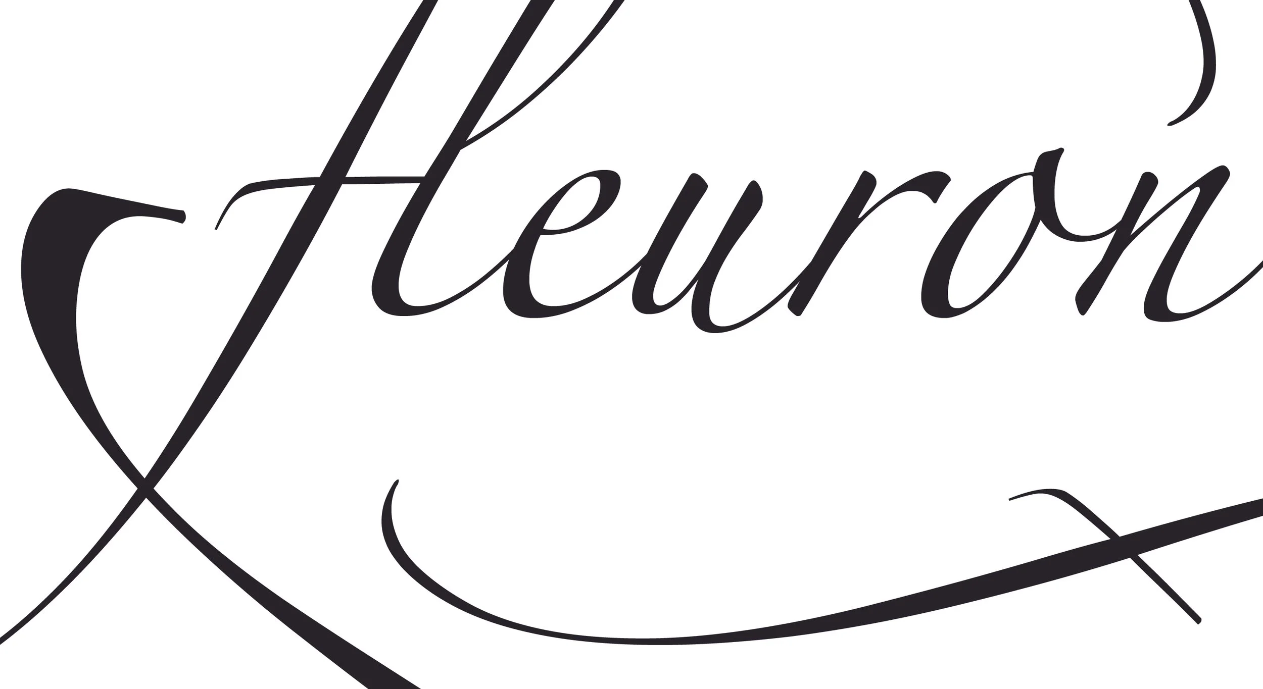
Initial Design Sketches
Deciding between a script font and a Sans Serif, I was creating different iterations by playing with a standard label or a die-cut. I ended up choosing a Sans Serif font because it looked cleaner and minimalistic, which supported the design story.