Name
Biasly
Skills
UI/UX Design / Collaboration
Create a music app in Figma with a collaborator, Hannah Phung. Through a series of weeks, we as a team conducted user research and created personas, wire framing, prototyping, low-fidelity user testing, high-fidelity UI, and user testing.
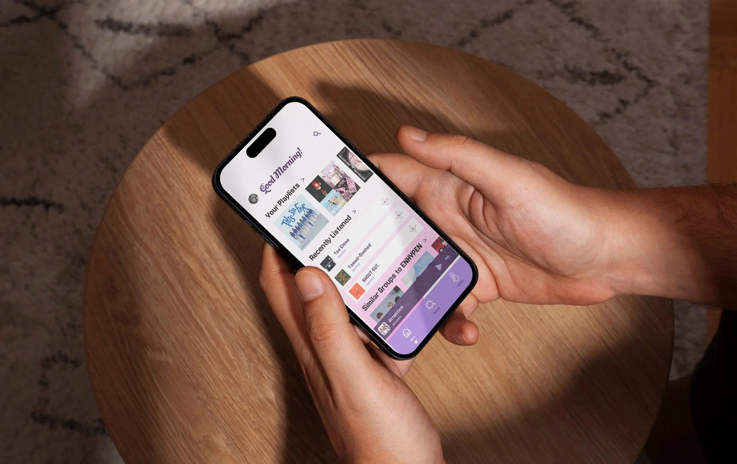
We want our music app to be those focused on listening to Korean pop artists. The demographic ranges from those who already listen to k-pop and those who are just starting/wanting to listen. We would like to have simple playlists for every listener with songs they like and is similar to it. It would be easy to see different artists, groups, albums, and playlists. We want to focus on simplicity and have our users to have a straightforward experience, while also enjoying its music; thus having Biasly created.

Final Logo
User Interview
We first decided on User interview questions, their demographics ranging from 16-40. After conducting their interviews on what they liked and disliked on their current used music apps, we analyzed competitive apps.
User 1: Su Le
Describe general demographic (age group, occupation): 20 year old, college student
________________________________
What is your favorite music application and what device do you use? Spotify, iPhone/ laptop
How often and what time of day do you use the app? everyday mainly in the morning when I’m doing my homework, and at night before bed.
What’s most appealing about the app? it creates personalized playlists based on taste and favorite songs.
What’s the hardest part about using this app? its expensive subscription
Was there anything surprising or unexpected about the app? you can use the equalizer to adjust the levels of bass and treble in music and podcasts.
What can be done to improve the app? fix the recommendation and song shuffle system.
What feature of the app do you use the most? Search bar, to find songs, albums, artists, and genres.
User 3: Matthew Salvador
Describe general demographic (age group, occupation): 17 year old, high school student
________________________________
What is your favorite music application and what device do you use? Apple Music, Iphone 11 Pro Max
How often and what time of day do you use the app? I use the app everyday, but it depends. Morning, Afternoon, on the computer
What’s most appealing about the app? Free because my parents have Apple Music, no ads to be listened to
What’s the hardest part about using this app? Not listening to the same time as someone else with the same account
Was there anything surprising or unexpected about the app? No, its just a music app, straightforward
What can be done to improve the app? Making it easier to listen to music similar to the one I am listening to.
What feature of the app do you use the most? Listening to my playlists
User 2: Gabby Simon
Describe general demographic (age group, occupation): 29 year old, non profit organizer
________________________________
What is your favorite music application and what device do you use? Spotify, IPhone/ car audio
How often and what time of day do you use the app? several times a day, mostly during my commute and while working in the afternoon
What’s most appealing about the app? personalized playlists and the huge variety of podcasts
What’s the hardest part about using this app? it’s hard to get it to learn my taste quickly
Was there anything surprising or unexpected about the app? different playlists are curated for very specific moods or activities.
What can be done to improve the app? a better way to filter out songs or genres I don’t want to hear
What feature of the app do you use the most? Discover weekly playlist
User 4: Mikesyl Araullo
Describe general demographic (age group, occupation): 21 year old, not in school
________________________________
What is your favorite music application and what device do you use? Spotify, Iphone15 Pro Max
How often and what time of day do you use the app? I use the app everyday, mostly nights but also daytime.
What’s most appealing about the app? I could make various playlists easily and choose which one to listen to based on my mood. I like how the algorithm lets me find new music along with the personalized playlists that Spotify makes for users based on their recent music activity. i also love how there’s so many features that it comes (with premium)
What’s the hardest part about using this app? When adding a song to a playlist, it shows a green check mark if I already added it, but sometimes it doesn’t. Also, it doesn’t show that green check if they’re the same song but different album.
Was there anything surprising or unexpected about the app? I was surprised when Jam sessions, when friends can listen together no matter where they are, first came out.
What can be done to improve the app? Premium users get everything, but free users are only allowed to do a few things. They should make the free app better for users, in the very least, to pick songs directly from a playlist and get less advertisements.
What feature of the app do you use the most? I enjoy making playlists the most.
Competitive Analysis
User Flow, Personas, and Wireframing
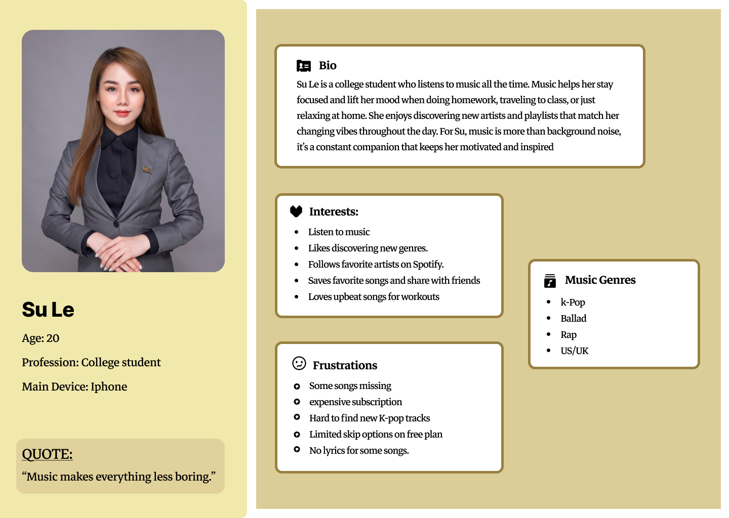
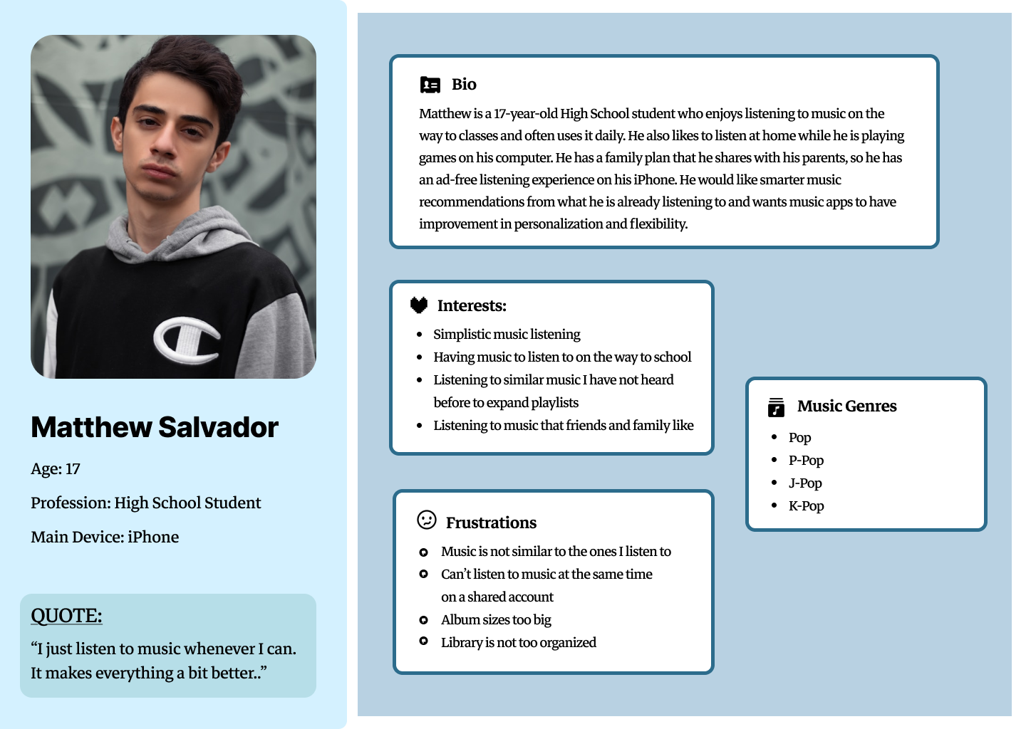
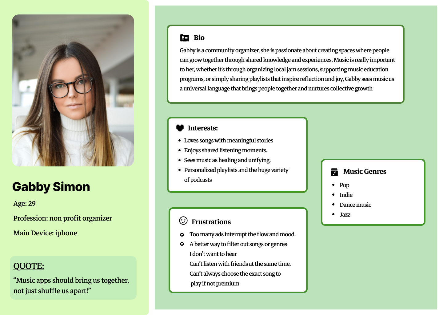
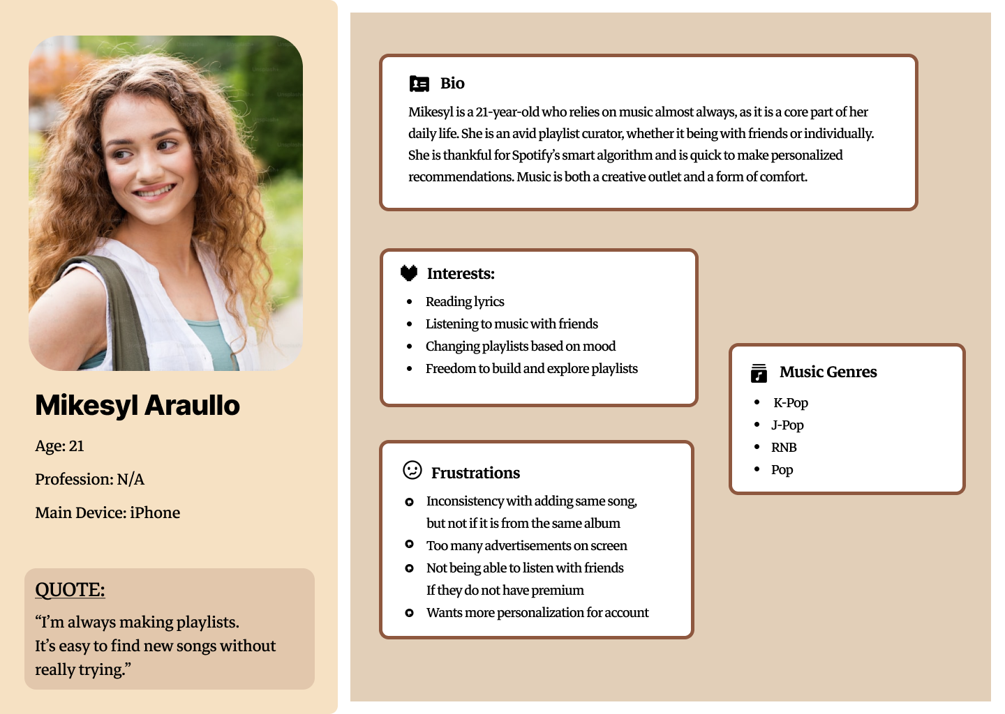
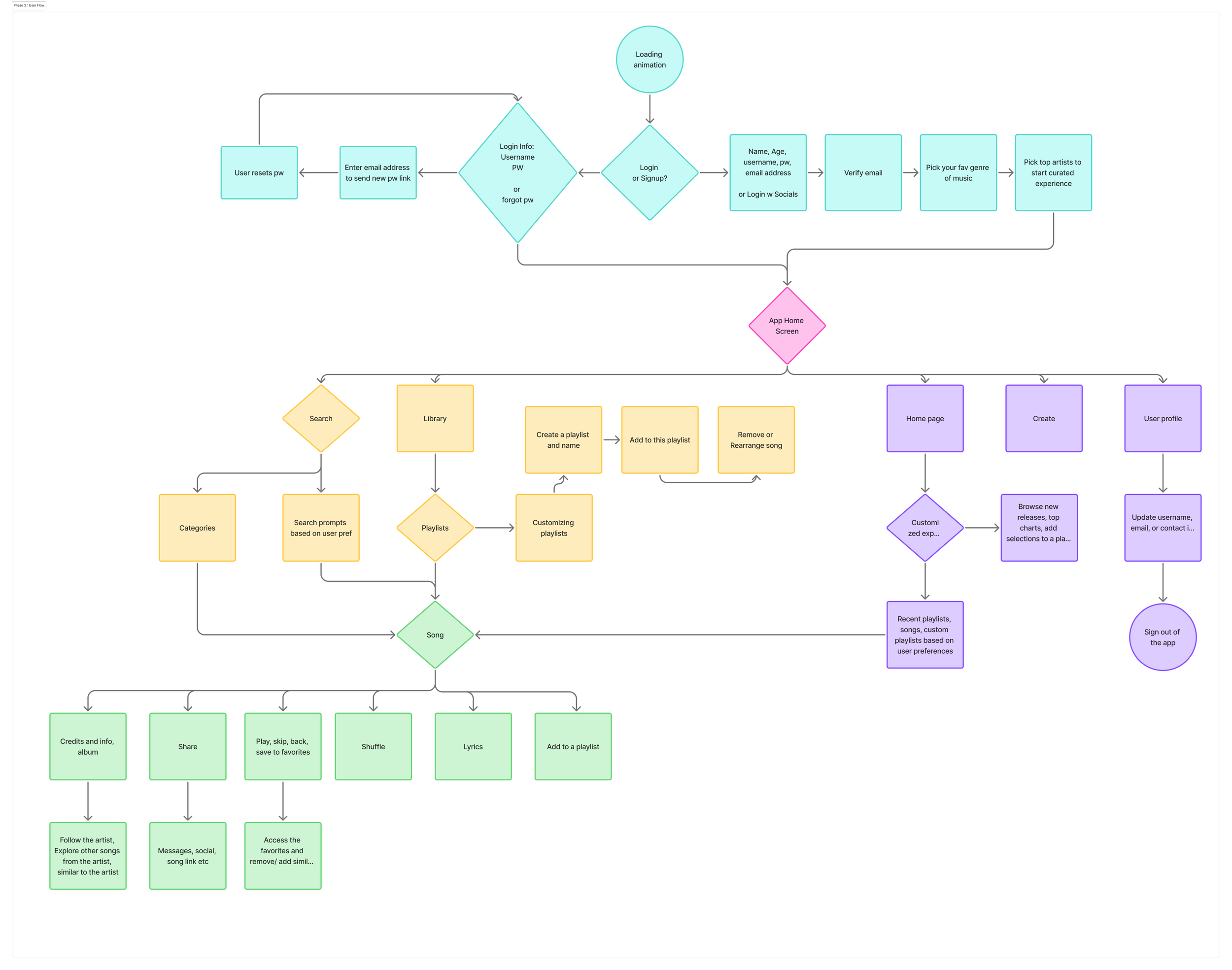
After interviewing and analysis, we created user personas and made a user flow based on our music app. Based on our napkin sketch, we created wireframes.
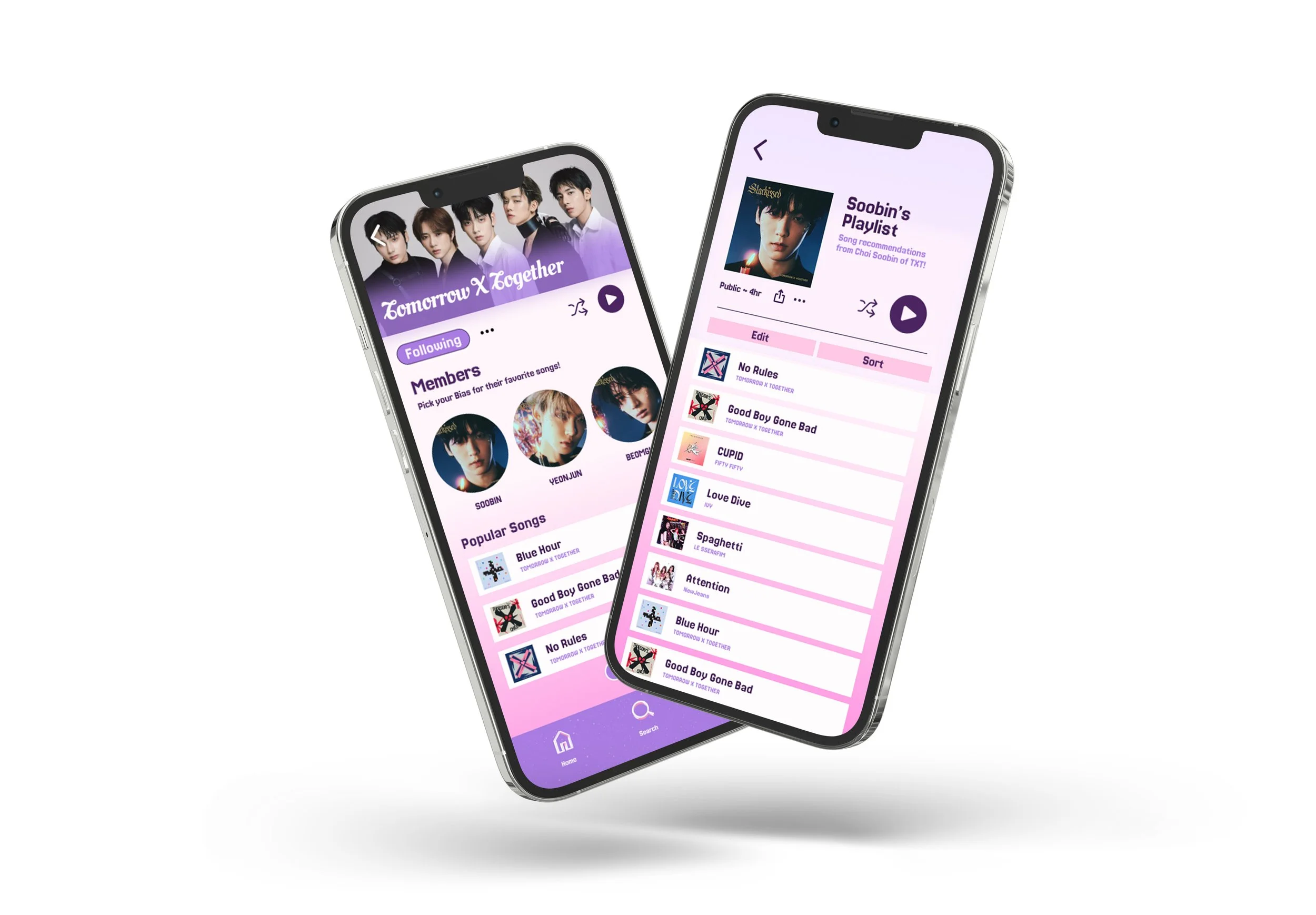
NEW ADDITIONS TO OUR APP: include a poll to choose who your favorite member of the k-pop group, then it creates a playlist that resonates with them and it also includes that members favorite current songs
Prototype and Low-Fidelity User Testing
On our wireframes, we started prototyping three different flows: log in, add/ remove a song to a playlist, and our unique flow. After testing on our users, we edited our app based on their feedback before continuing.
Recorded Data
User 1:
everything worked how he thought it would, easy to find and navigate through
Artist page: feel like some content is too close to each other, would accidentally click the wrong button
Artist page: the labels were confusing, it said there was playlists but it looked like songs
User 3:
The navigation icons are pretty easy to find
The layout is organized well, with playlists, albums, and artists all easy to reach
There’s enough spacing between sections, so it’s comfortable to scroll through and doesn’t feel crowded.
Clicking on an artist or playlist brings you to the right page,
Only suggestion is to make the overall experience a bit smoother for the user.
User 2:
the contents are easy to understand and everything is spaced fine
the icons are sized well
everything worked as how they thought it was
User 4:
Some sections could use a little more structure, maybe clearer separation between different content blocks so it’s easier to focus. (Space in between different songs or make the song bigger)
A few of the icons or labels could be a bit clearer
The headings are easy to read
Some screens do feel a bit crowded
The flow makes sense.
What did you learn from the overall experience and what do you plan to improve?
We found it interesting what users press and think in real time. Some users said it went well, but we wanted to nitpick even the smallest details so users will not have a problem with anything. We plan on increasing the padding between clickable buttons.
Users were confused at first and didn't know how it works. So I think we can have a clearer content, it would be easier to follow through
Will the improvements to these flows benefit other flows of the app? If so, how?
Users will have a more friendly experience and would not get irritated when they accidentally click on other buttons.
Design System and High-Fidelity User Testing
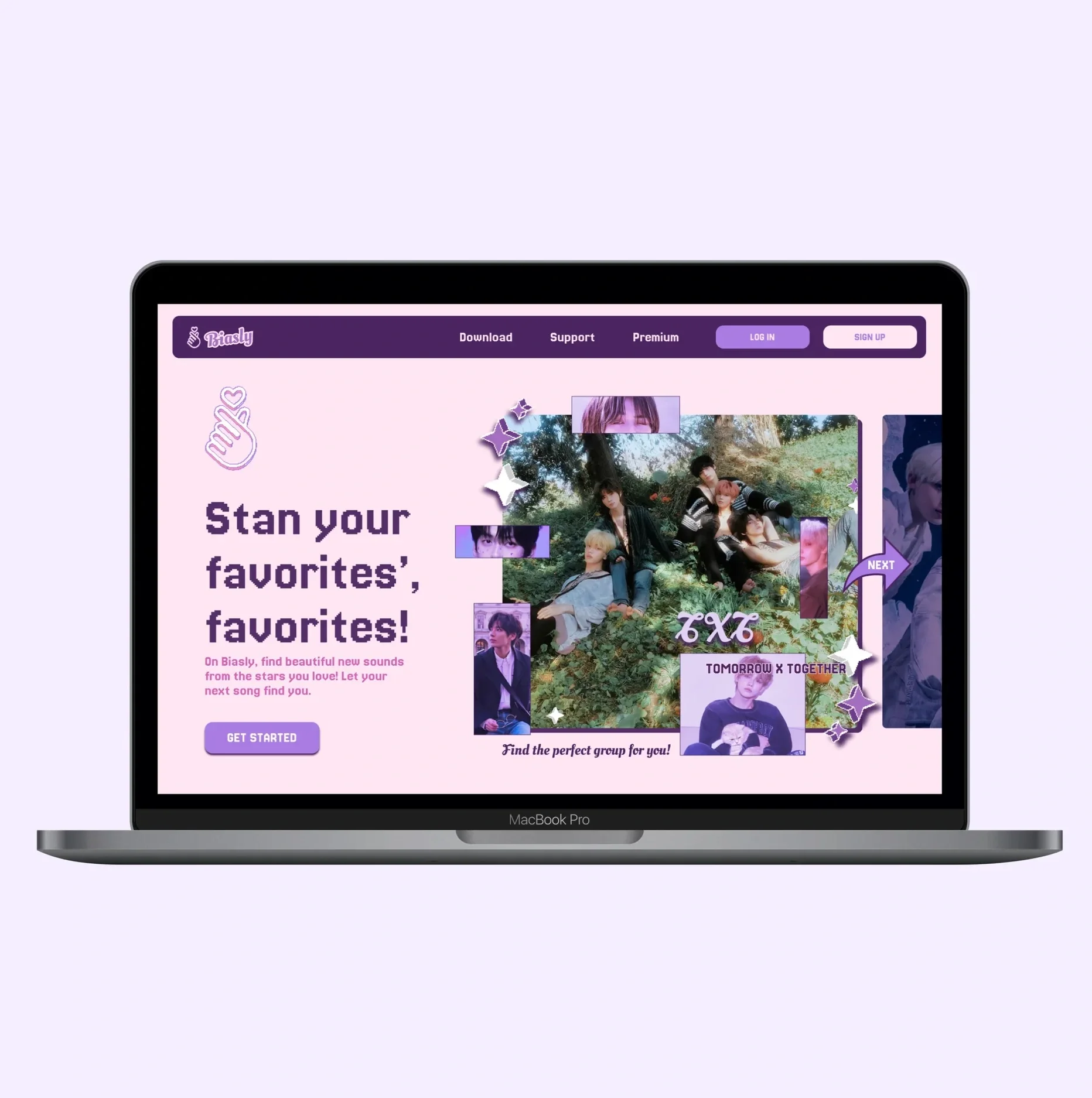
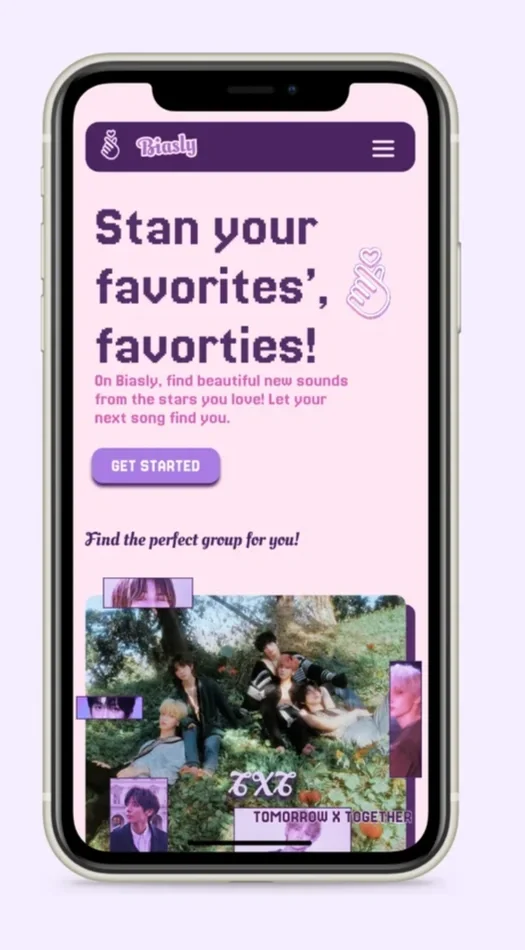
At this stage in our project, we created a moodboard after looking at different Kpop albums and a name for the app, Biasly. It is focused on purple and pink elements and has accents of pixels, stars, and hearts, which give a Y2K feeling.
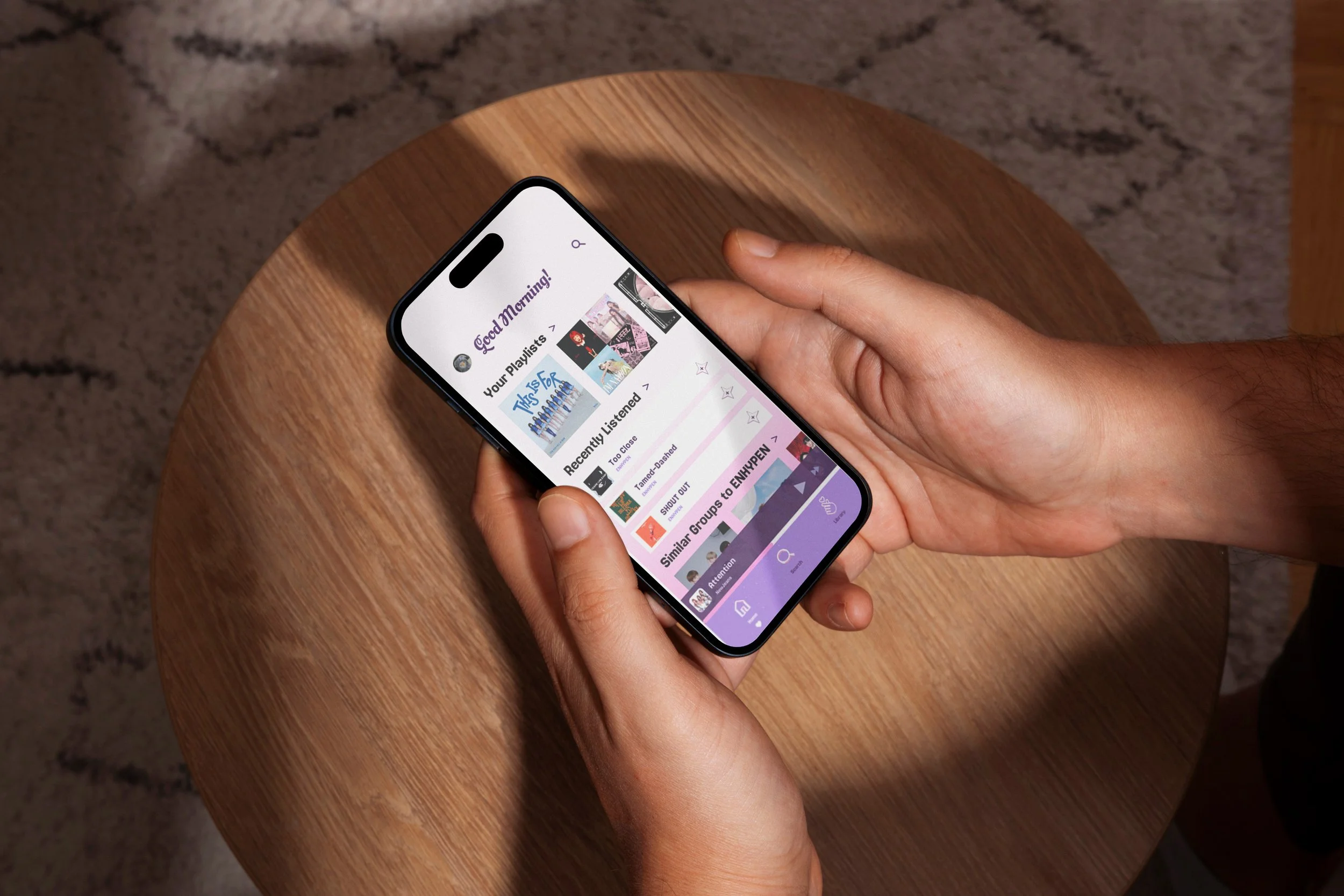
Final Application
Here is the clickable prototype after many rounds of user testing! This flow focuses on the final feedback we received.